
Graphic Design Trends 2026: What Food Brands Need to Know
Something interesting is happening in design right now. After years of ever-cleaner interfaces, flatter logos and AI-generated everything, brands are reaching for rough edges. Handmade textures. Ink on paper. Typefaces that look like they were cut out of a magazine.
The graphic design trends for 2026 tell a consistent story across every major creative industry report, from Adobe and Creative Bloq to It’s Nice That: consumers are fatigued by digital perfection, and the most interesting brands are deliberately imperfect in response.
For food and drink brands, this matters enormously. Packaging, social content, menus and point-of-sale materials are all increasingly judged by how human they feel. Here’s what the trends are telling us and what they mean for your brand.
What graphic design trends matter most for food brands in 2026?
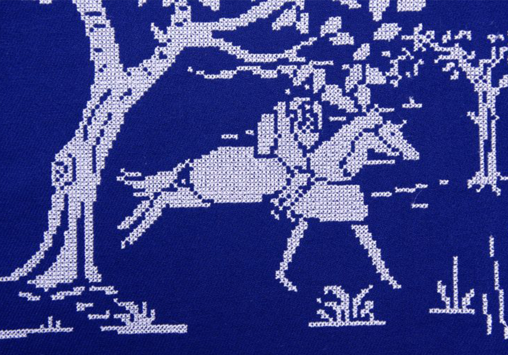
The single biggest theme running through every major design forecast for 2026 is the deliberate rejection of AI’s ultra-polished visual language. Creative directors at global agencies are calling it ‘anti-AI crafting’ and it’s showing up everywhere from political campaign posters to luxury fashion.
Burberry’s Winter 2025 campaign using hand-stitched textile visuals and embroidered details is a good example of work that could only have been made by human hands. OpenAI, of all companies, launched its first major consumer campaign in 2025 shot entirely on 35mm film. Apple’s latest Apple TV intro features a hand-blown glass apple rotating in real light, with no CGI in sight.
The food and drink sector has always been comfortable here. Artisan bakeries, craft brewers and independent producers have long used hand-drawn illustration and rough print finishes as part of their identity. The difference now is that this aesthetic is moving upstream into mainstream retail and premium brands, because it signals something algorithms can’t fake: genuine care in the making.
For food brands, ask yourself whether your packaging, your social content and your marketing materials could have been made by a real person working with real materials. If the answer is obviously no, it might be worth a conversation with your design team.
Source: Creative Bloq — Texture, warmth and tactile rebellion: the big graphic design trends for 2026
Food packaging design trends: texture takes centre stage
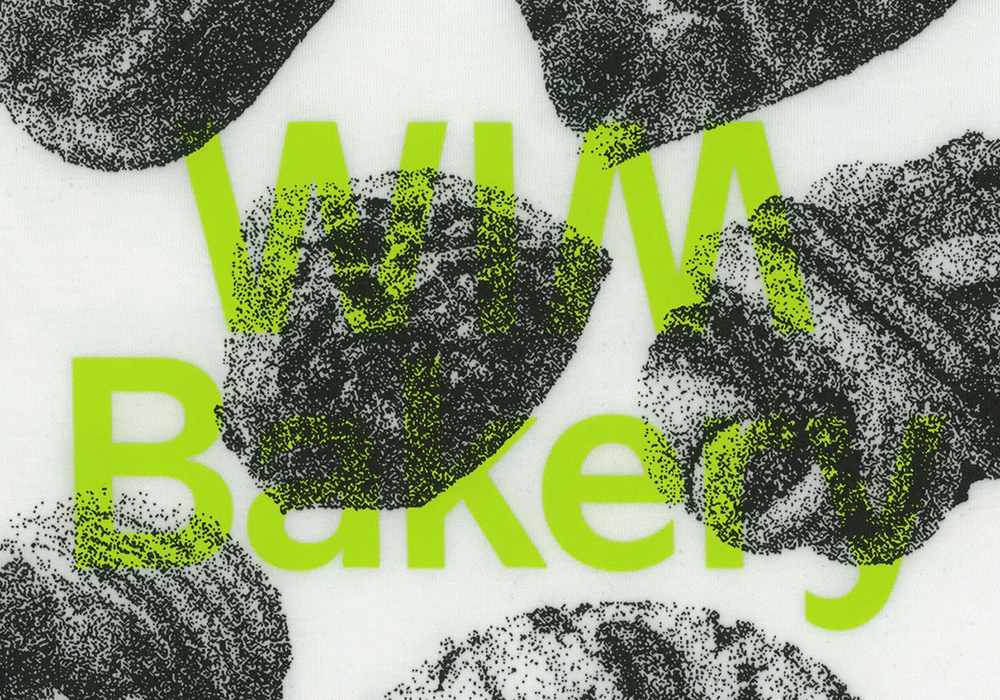
Closely related to the handmade movement is a much broader appetite for tactile, sensory design. Puffy surfaces, squishy letterforms, materials that mimic touch. Adobe’s 2026 Creative Trends Forecast puts this front and centre: people want to feel transported, and design is increasingly being asked to simulate physical experience.
In print, It’s Nice That has tracked what they describe as the ‘warning low ink’ look, a studied return to photocopier-quality, greyscale imagery where deliberate imperfection becomes the style. Brands like Big Cartel have used scrunched printed paper and the flat, slightly dusty quality of a Xerox scan as part of their visual identity. Type designer Charlotte Rohde launched a typeface with a campaign that looked like the printer had just given up halfway through.
This is relevant for food brands in ways beyond the obvious. It speaks to a broader consumer preference for things that feel real, unpolished and produced with intention. Earthy textures, stone and bark surfaces, visible print grain and analogue colour irregularities are all gaining ground against clinical, photorealistic food photography.
It doesn’t mean your product shots need to look underexposed. It means the overall visual world around your brand can afford to breathe, be rougher and show the process.
Source: It’s Nice That — The graphic trends you’ll want to bookmark for 2026
Typography: when the type is the entire brand
Typography is having a moment. Several moments, actually, and none of them are subtle.
At one end, brands like Oatly have shown for years that a quirky, handmade typeface can be the entire personality of a brand. The Whitney Museum built its whole visual identity around a typographic mark. Spotify’s Wrapped campaign is almost nothing but type. These are cases where the letterforms carry the emotional weight of the brand entirely.
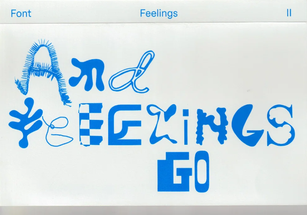
At the more experimental end, designers are scrapping consistency entirely. It’s Nice That has identified what they call ‘pick and mix’ typography, lettersets sourced from secondhand bookshops, cut and reassembled, or built from unexpected materials like football pitch markings or strips of tape. Legibility is optional. Expression comes first.
For mainstream food brands, the takeaway is less about going fully experimental and more about type having earned its place at the front of the design. If your brand typography could be replaced with any other brand’s typography without anyone noticing, that’s something worth addressing in 2026.
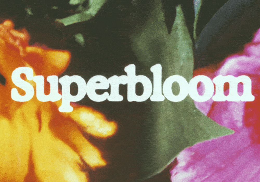
Adobe also flags exaggerated, playful lettering as a specific trend: oversized sans-serifs, bubbly letterforms and handwritten scripts with genuine personality rather than the smooth, interchangeable cursives that have dominated packaging for the last decade.
Source: Creative Bloq — Texture, warmth and tactile rebellion: the big graphic design trends for 2026
Colour is making emotional statements in 2026
Two colour directions are pulling in opposite directions in 2026 and both are relevant to food and drink brands.
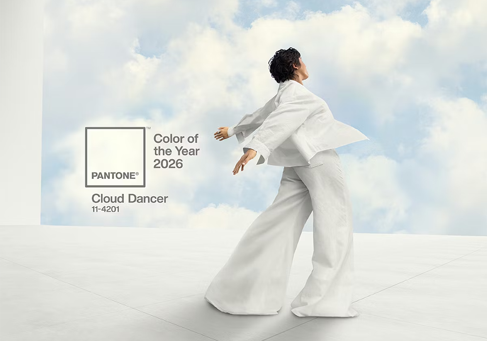
The first is warm, grounded and earthy. Pantone’s Colour of the Year for 2026, Cloud Dancer (PANTONE 11-4201), is a soft off-white that sits comfortably alongside muted ochres, dusty terracottas and the kind of palette you’d expect to find in a farmhouse kitchen. This direction works particularly well for wellness, health food and premium ambient grocery products where trust and authenticity are the primary signals.
The second direction is the opposite: bright, saturated and almost aggressively expressive. Adobe describes this as ‘immersive, high-energy’ colour, being used to create surreal, dreamlike brand worlds that stop scrollers in their tracks. Big blocks of neon alongside unexpected combinations, the sort of colour choices that feel more like a fairground than a supermarket aisle.
Both approaches share one thing: they’re making deliberate emotional statements. The days of playing it safe with food-safe greens and harvest golds are fading for brands that want to stand out. Colour is increasingly being used to say something specific about who a product is for and what it believes in.
Source: Creative Bloq — Texture, warmth and tactile rebellion: the big graphic design trends for 2026
Packaging that tells a story, not just displays a product
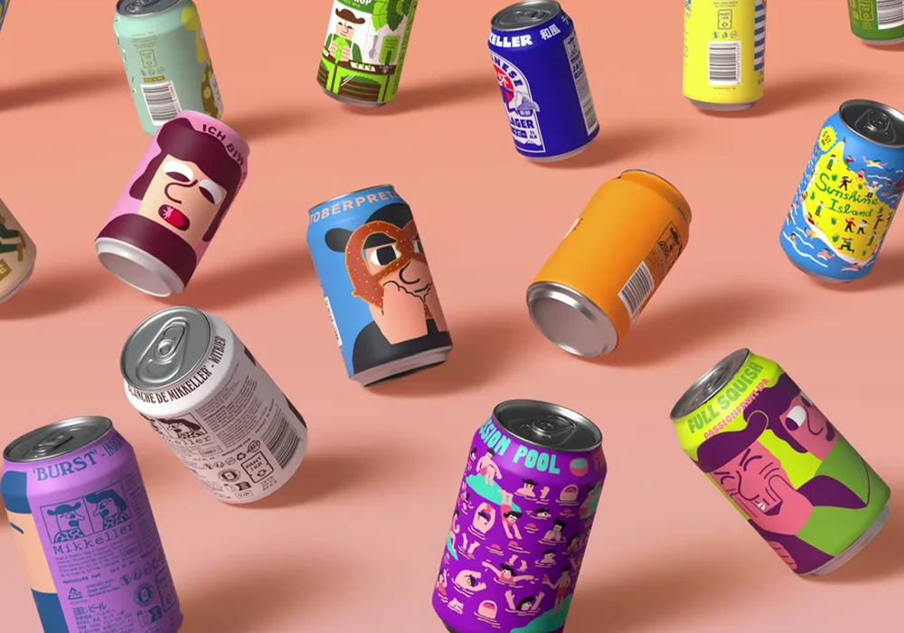
Layered illustration as a packaging approach has been growing for a couple of years, but 2026 looks set to push it into the mainstream. The idea is that every element of a pack — shapes, textures, characters and typography — works together to tell a story at a glance rather than simply label a product.
Mikkeller’s illustrated beer range is the most cited example: each can tells its own story through layered, character-driven illustration that’s recognisable from across a room. BrewDog’s specials packaging uses graphic layering for immediate shelf impact. This approach has become a practical way to communicate flavour, variety and brand personality simultaneously without overcrowding the design.
Related to this is the collage and mixed-media approach that Adobe has identified as a core 2026 trend: visible layers of photos, doodles, stamps and brush textures that add depth and suggest a narrative. It sits well alongside the handmade aesthetic already discussed, but it’s also being applied digitally to social content and campaign materials.
For food brands with a story worth telling, whether that’s provenance, craft process or a strong founding narrative, this is the year to put it on the tin. Literally.
Sources: Creative Bloq / Adobe Express
Logos are going fluid: what it means for food and drink brands
It’s Nice That has spotted a clear shift in logo design that’s particularly well-suited to brands existing in digital and physical spaces simultaneously. Logos are becoming more fluid and organic, less permanent and monolithic, more variable and alive.
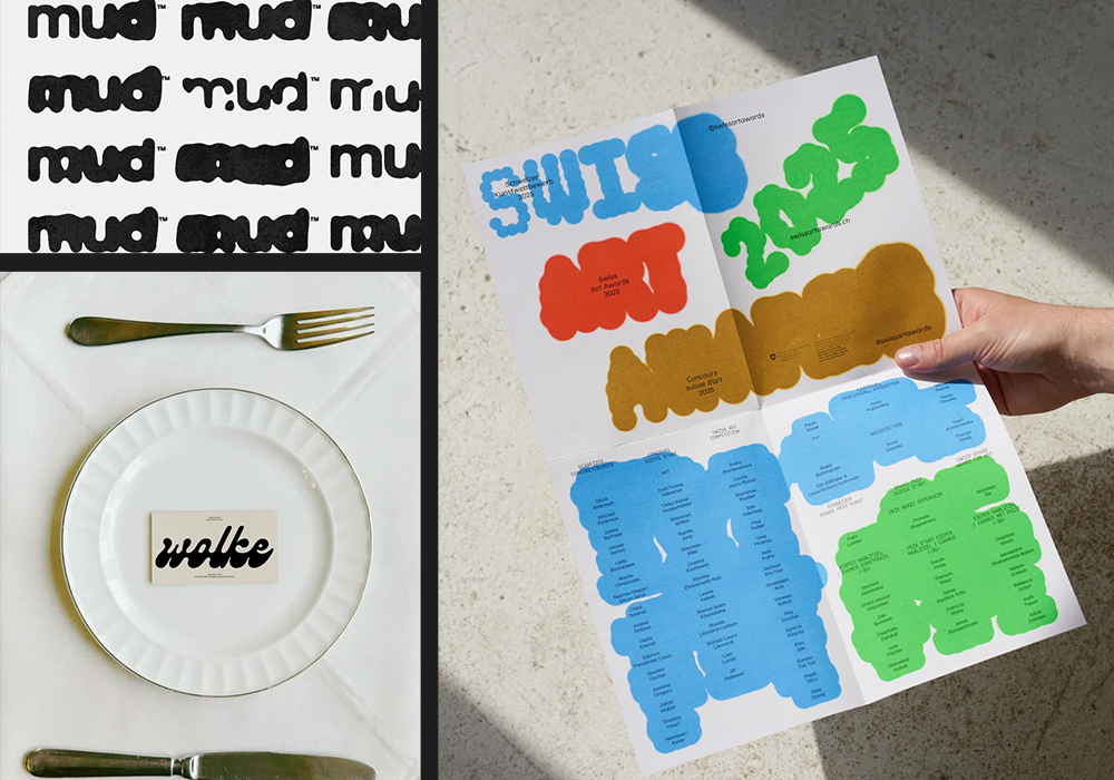
Think forms that look like they’ve been drawn with a leaking marker. Lettermarks that blur at the edges. Wordmarks with bases that appear to melt. Monotype’s identity for lingerie brand Chantelle Pulp uses letterforms that gently stretch and distort as part of their brand expression. A dog-wash brand called Mud built their entire identity around a deliberately messy, splashy mark.
The practical logic here is motion: fluid logos look like they’re already moving, which makes them far more natural in animated contexts, from social media to in-store digital screens. For food and drink brands thinking about how their identity performs across video content and digital display, this direction is worth attention.
It also happens to work particularly well for categories where fluidity, freshness and natural origins are part of the product story: drinks, dairy, sauces and fresh produce.
Source: It’s Nice That — The graphic trends you’ll want to bookmark for 2026
Minimalism isn’t dead. It’s just warmer now.
Not everything in 2026 is heading toward maximalism and layered chaos. Clean design is still very much present, but the version showing up now is warmer and more characterful than the cold minimalism that dominated the previous decade.
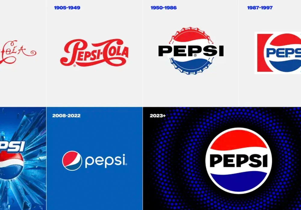
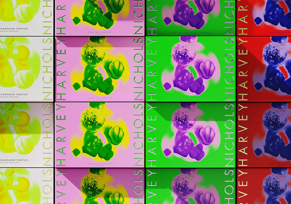
Pepsi’s recent rebrand, Burger King’s redesign and Harvey Nichols’ own-label refresh all demonstrate what’s being called ‘bold minimalism’: brands looking back at their heritage, taking retro typefaces and familiar palettes, then updating them with cleaner lines and sharper contrast. The result feels reassuring without feeling dated.
In food and drink, this is relevant for anyone considering a rebrand or packaging refresh. The clean-but-cold approach of the 2010s doesn’t feel contemporary any more. Clean-but-warm, with a touch of heritage and a bolder typographic presence, is where the market has moved.
Glossier, Thinx and The Sunday Standard are the beauty sector examples most cited, but the principle translates directly to premium ambient grocery, health food and foodservice packaging.
Source: Creative Bloq — Texture, warmth and tactile rebellion: the big graphic design trends for 2026
So what does this mean for your brand?
The thread running through all of these graphic design trends for 2026 is the same one: consumers are pushing back against a world that feels increasingly generated. Design that looks like it came from a template, a stock library or an AI prompt is starting to feel interchangeable, and that’s bad for brands.
Food and drink has a genuine advantage here. This sector has real stories to tell about craft, provenance, people and process. The design trends of 2026 are built almost perfectly for telling them — and the brands that move first will own that space before their competitors realise it’s available.
Whether that means a packaging refresh, a new brand character, a more expressive typographic identity or simply committing to imagery that feels less like a stock photo and more like something made by someone who cares, the brief is clear. Don’t look generated. Look made.
If you’d like to talk through what any of these trends could mean for your brand specifically, we’d love to have that conversation.
Sources Used
Source 1: Creative Bloq — https://www.creativebloq.com/design/graphic-design/texture-warmth-and-tactile-rebellion-the-big-graphic-design-trends-for-2026
Source 2: It’s Nice That — https://www.itsnicethat.com/features/forward-thinking-graphic-trends-2026-graphic-design-120126
Source 3: Adobe Express — https://www.adobe.com/express/learn/blog/design-trends-2026
- The rapid rise of AEO and GEO; is your AI reputation being written without you? - 26th March 2026
- Graphic Design Trends 2026: What Food Brands Need to Know - 25th February 2026
- CBD Drinks: The Functional Beverage Trend Shaping the Future of Refreshment - 13th November 2025