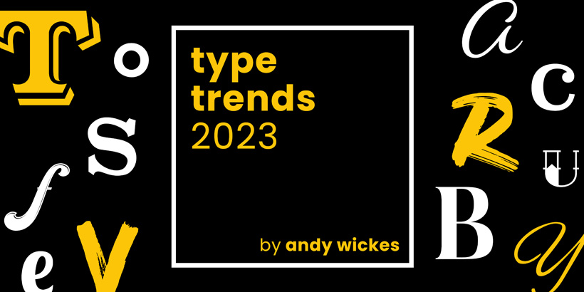
Type Trends for 2023
Typography. You just click the drop-down and choose something you like the look of. Simple. Serif if it’s formal, sans-serif if it isn’t. Job. Done. Well no. Typography is almost certainly the most under-appreciated element of visual design. Done well it’s amost invisible. Change the typeface on Apple, on Easyjet, on Nike or on Converse, and the entire brand is lost. It’s the tone of voice, it’s the personality, it’s the rhythm and meter of the message and it’s been that way since the earliest letterforms began organising communication, writing histories and spreading news around our world. So what should be looking out for in 2023. Read on good traveller, read on.
Matchmaker

Let’s talk about the matchmaker trend – it’s a continuation and expansion of last year’s popular trend. Instead of sticking to three colors, why not use thirty? This trend celebrates diversity, equality, and inclusion in a visually stunning way. It reflects the attitudes, values, goals, and missions of this generation. Mix-up is all about embracing the complexity and richness of the human experience on Earth. It adds depth and interest to designs, while also being active and inclusive. In short, it’s a celebration of what makes us human and alive – our diversity and biodiversity.
Introducing the matchmaking trend, Loopy, which has gained significant traction over the past year. It is now evident that this trend is not a standalone phenomenon but rather a part of a larger shift in the approach to pairing. Loopy forms introduce organic movement and are commonly paired with static type to create a sense of tension and drama. Marlon Studio, a Prague-based design studio, has expertly infused the logotype of Wild Kombucha with effervescent waves, showcasing the exceptional potential of this trend. The curly forms of Loopy may suggest a human touch, like a signature, or a connection to the natural world, contrasting with the rigidity of grids and geometry. Along with the Flux trend, Loopy forms are often portrayed in motion or as static shapes that appear to be in motion, giving the impression that the characters were designed for animation. The recent refresh of Limburgs Museum by Total Design employs bouncing letterforms and exciting colors to express the promise of progress and change. These graphic elements are particularly striking when paired with the museum’s muted colors and detailed imagery from its historical art collection.
smart grid
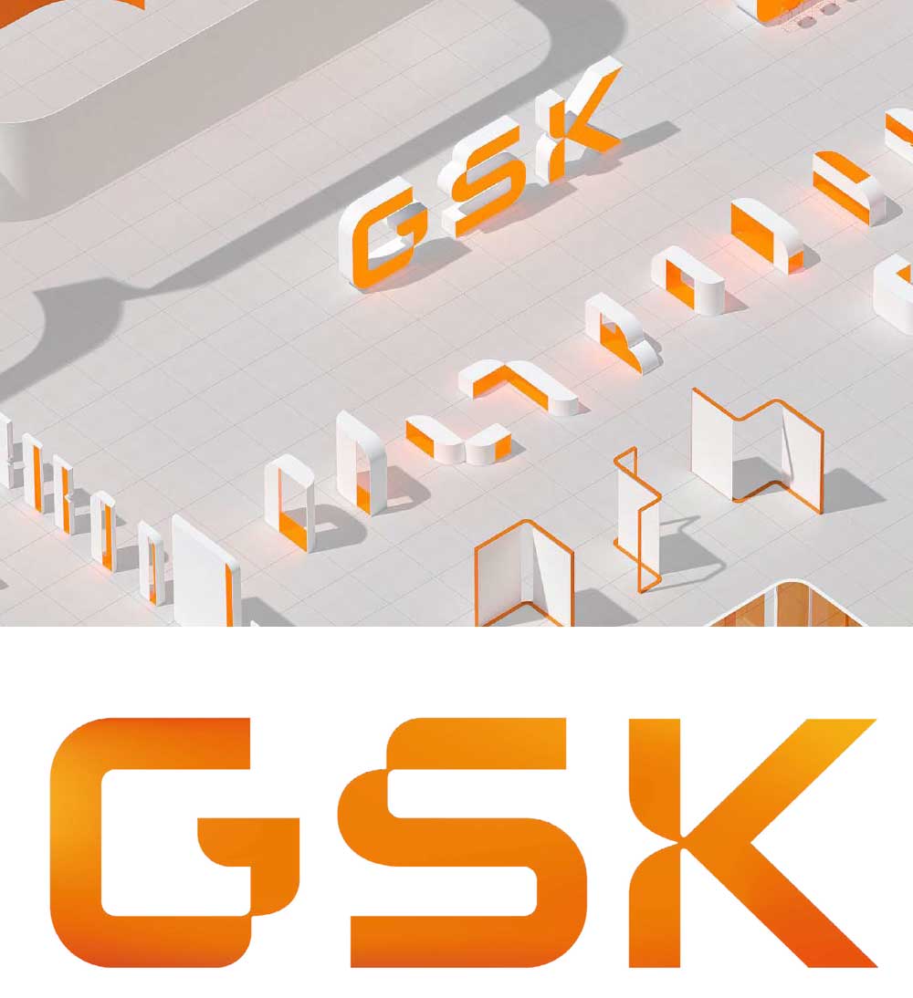
In the previous year, we presented the concept of Organic Modular, which represents the progression of the “Blockheads” trend of 2021. Based on the utilization of the grid as an organizational principle, the typeface embodies an organic and captivating essence. Currently, in its third iteration, it has evolved into Smart Grid, a fusion of art and science constructed upon grid structures that have been discreetly disrupted by quarter or half circles. This trend follows in the footsteps of the NASA “worm” logo, where science and technology brands unite under our apprehensions and aspirations about the future and the unknown. While grids remain the primary focus, they have been delicately softened and meticulously tailored with a touch of sophistication.
Wolff Olins’ design for the new symbol of the biotech conglomerate GSK flawlessly encapsulates this scientific appearance through the well-organized precision of a grid, which has been imbued with a natural and humanized aspect by incorporating curved elements. This approach advocates for a harmonious integration of technology and nature.
superhero

A new trend has recently emerged, characterized by striking outlines and shadows, often tilted, skewed, or curved to create a sense of perspective. The trend is defined by its explosive use of vibrant colors and playful, comic book-like vibes. Its sudden rise in popularity may be attributed to the worldwide success of comic book movies, serving as a cultural zeitgeist for this new aesthetic. Aptly named “Superhero,” this trend is teeming with electrifying and dramatic effects that are designed to be big, bold, and fun, often punctuated with an exclamation mark. Superhero has quickly become the talk of the town!
Leading agency &Walsh has developed a bold and playful brand identity, complete with custom typeface, for Stompy, a wine subscription service aimed at a modern audience who are seeking to break away from the traditional stuffy and intimidating formality of wine culture. The typeface is intentionally provocative, featuring fat shadows and bright colors reminiscent of the iconic work of Roy Lichtenstein, setting it apart from the typical sleek and serifed wine packaging that tends to rely on darker, more natural palettes.
super sober
In 2023, the graphic austerity that once dominated the face of numerous startup and lifestyle brands in the 2010s has resurfaced as a focal point once again. “Super sober,” an underlying trend that never truly vanishes, may be notable yet again due to its stark contrast against the unapologetic exuberance of “Mix-up” and “Superhero.” Often presented in black and white, this trend exudes simplicity and balance, with ample white space lending to a calm, precise look that emphasizes the small bits of type, logos, or iconography that remain. In crowded and noisy marketplaces, “Super sober” can be a much-needed moment of peace and quiet, much like an empty bench in a bustling airport. Its minimalistic approach allows it to stand out in a landscape filled with competing brands, apps, and notifications.
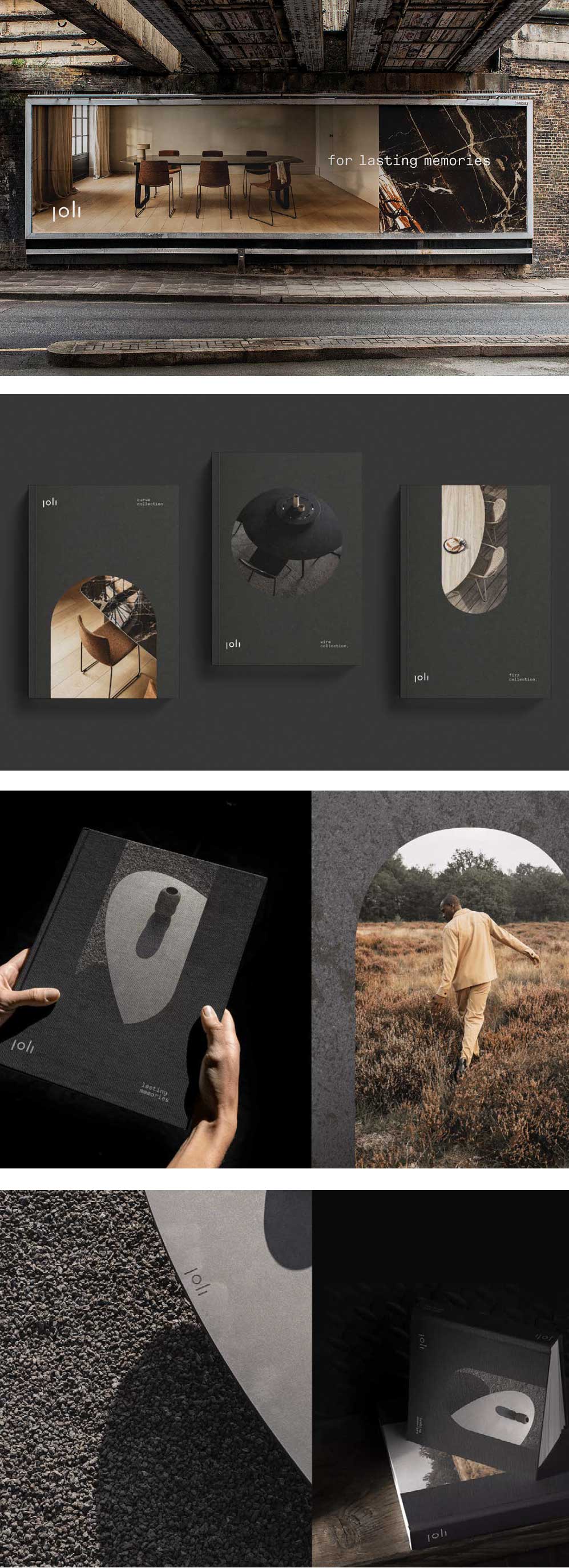
When tasked with refreshing the branding of furniture company Joli, Skinn branding agency employed a clever design that skillfully integrates a plate with utensils into a geometric shape that aligns perfectly with their custom tables. The branding does not overpower the quiet sophistication of the product design, while a serene and natural color palette reinforces an appreciation for materials.
making the cut

Presently, a trend of cutting and removing select pieces from designs has emerged, often creating an exaggerated feeling of sharpness. Certain variations of this trend present a high-tech and pixelated aesthetic, as evidenced by the new Verge logo. One possibility is that designers are experimenting with the concept of speed; triangles convey a sense of swiftness, while squares evoke slowness. Cropping is another technique being employed, suggesting movement or a third dimension. These treatments frequently inject sparkle, motion, and visual interest into an otherwise plain sans-serif design, effectively elevating the ordinary to the extraordinary.
As a leading tech publication, The Verge adeptly embraces the cutting trend by skillfully removing specific portions of their typeface. This approach creates a captivating sense of motion, energy, and tension, even when the design is static, much like a parked Ferrari. Given the rapid pace of technology news, this brand remains at the forefront by utilizing hip typefaces and an electrifying color palette to maintain a contemporary and dynamic feel.
pixel play
![]()
The Pixel play trend continues to gain momentum, fueled by a deep-seated affection for our digital tools and a strong dose of nostalgia. Some designs employ pixelated forms akin to those featured in our Making the cut trend, incorporating moments of interest or marking their digital territory. Others incorporate beautiful glitches to add texture. Pixel play can evoke a sense of playfulness, reminiscent of vintage video games, and often pays homage to early digital experiences. The simplicity of the square construction belies the complexity and sophistication of the design, much like elaborate Lego kits. In fact, the limitations imposed by this seemingly crude technique can foster perseverance and enhance creativity.
NB Studio in the UK recently refreshed the branding for Kudo, adopting a gamification and simplification approach that effectively distinguishes them in the insurance industry. The playful and approachable 8-bit graphics employed in this design align perfectly with the Pixel play trend.
flux

As previously noted in our report from last year, dynamic elements are increasingly capturing attention in the design world. Variable fonts, including icons, are now able to move and shift around, giving the impression of motion even in static designs. As we continue to shift away from paper-based mediums and towards screens, there is a growing emphasis on designs that can move and evolve in response to user input.
One particularly innovative example of this trend is the Aerial typeface, created by Hobbes, a Detroit-based motion studio. This typeface is designed to be assembled by drones in mid-air, and showcases the potential for three-dimensional design to push the boundaries of traditional typography. Projects like this, along with the growing popularity of AR and VR technologies, offer a glimpse into the exciting possibilities of design in the years to come.
Another notable case study is the branding for the 2022 Brand New conference, which was developed in collaboration between UnderConsideration and motion designer Sultan Jum, also known as Geo. Using Nuform Type’s Ozik, the team created a bold, kinetic design that pays homage to the conference’s host city of Austin, Texas and its motto of “Keep Austin Weird.”
volume up

Following the emergence of the Solid Gold trend last year, it is apparent that 3D modeling has gained significant traction and is now ubiquitous. This development prompts us to consider whether advancements in design tools and technical skills have facilitated this trend. Furthermore, it begs the question of whether 3D modeling and animation have become an integral part of graphic design, thereby blurring the lines between these fields.
With the increasing capabilities of consumer electronics, laptops can now render high-quality, glossy, and intricate designs that were previously unattainable. For example, Pentagram’s work for the Mellon Foundation, a significant funder of arts and humanities in the US, features a logomark with a dynamic letter ‘M’ that captures the gestural quality of the human hand. The logomark can incorporate various colors or materials outside of the identity’s neutral base, complementing the featured content. Moreover, the logomark can be rendered in diverse mediums and materials, such as textures, 3D molds, or animations, evoking various art forms like sculpture, dance, painting, and writing.
As Augmented Reality (AR) and Virtual Reality (VR) technologies continue to gain traction, capturing volume may become an essential aspect of design. Contemporary textures are now richer and more realistic, departing from the plastic-looking world of Toy Story. Lavish textures and lighting, such as chrome, glass, and wood, are now standard in design.
liquify

This trend marks a continuation from last year, where the Acid Flow trend has undergone a metamorphosis into what we now refer to as Psychedelic, a subgenre of Liquify. There is a heightened emphasis on soft and organic forms, with the more intricate looks of Svelte Serif and Neue Nouveau trends experiencing a decline. In contrast to the Softserve serif trend, which focused on typefaces with rounded serifs, this trend embraces a more unconventional, organic and lively approach.
This style has gained popularity among food enthusiasts, appearing on a wide range of food items such as ice cream, soda, and coffee. Custom lettering with lava lamp forms is a hallmark of the Psychedelic trend. For instance, Swerl Coffee Roasters’ online coffee subscription service originated from a 1972 Mercedes van, reminiscent of the flower power era. Inspired by the van, designer Andreas Pedersen created a groovy serif wordmark with swirly forms resembling a milky latte.
In this trend, the emphasis is on melted and liquefied forms, with legibility and readability becoming secondary considerations. Dakota Light-Smith from Day Job designed a chewy chocolate bar, Dirtbag, featuring a pleasing pink packaging with a melty wordmark, exemplifying this trend’s essence.
ai painting

The field of AI design tools is rapidly evolving, with new advancements emerging at a startling pace. Although AI painting fonts may still be in their infancy, this is an area that warrants close attention, as AI is poised to significantly impact the art and design world. The full extent of its influence remains to be seen, as artists explore and experiment with the possibilities that AI offers.
One key advantage of AI is its ability to accelerate the prototyping and ideation stages, freeing up valuable time for strategic decision-making. However, the aesthetic results of AI-generated designs can vary in quality, often bearing a collaged or smudged appearance, leading to a sense of unease that challenges our trust in this technology.
The book “Artificial Typography” by Andrea A. Trabucco-Campos and Martín Azambuja delves into these questions by using AI to imagine alphabets by famous artists, architects, and designers who never specialized in type design. The book showcases the results of this experiment, featuring 26 letters viewed “through the lens of 52 iconic artists across various media,” yielding astonishing and thought-provoking outcomes.
As we look to the future of AI design, it is important to consider the lessons of the past. The industrial revolution promised greater productivity and efficiency, yet the gains made were often absorbed by corporate profit and growth, with workers still expected to put in the same amount of time and effort. We must therefore ask ourselves: will AI provide us with more productivity and speed than we can handle? Only time will tell.
Research credits:
Monotype 2023
Image credits:
Naughty Roll.
Agency/designer: indigo design / macau.
2022 Figma Config.
Agency/designer: Figma Brand Studio, Bijan Berahimi,
Fisk. Supporting typeface: Whyte by Dinamo.
BASE media.
Agency/designer: Stepan Solodkov.
Wild Kombucha.
Agency/designer: Marlon Studio.
Limburgs Museum.
Agency/designer: Total Design. Typeface: Gilroy by
Radomir Tinkov.
Sommerro.
Agency/designer: Bielke & Yang. Typefaces: Custom.
GSK.
Agency/designer: Wolff Olins. Supporting Typeface: GSK
Precision (customized F37 Jan).
Stompy.
Agency/designer: &Walsh. Typeface: Custom.
Forward Majority.
Agency/designer: Order. Typeface: Original Sans by
Commercial Type.
Thor, Love and Thunder.
Agency/designer: Perception.
Joli.
Agency/designer: SKINN BRANDING AGENCY. Supporting
Typeface: Messina Sans Mono by Luz Type.
The Verge.
Agency/designer: Vox Media Design Team. Supporting
typefaces: Poly Sans by Gradient Type, Manuka by Klim,
FK Roman by Florian Karsten Studio.
Konnichiwa Zhongshan.
Agency/designer: Valenlim Studio and Hammam Hidayat.
Boxy.
Agency/designer: Koto Studio. Supporting typeface:
Avantt by Displaay Type.
Oku.
Agency/designer: DutchScot. Supporting typefaces:
Original Sans by Commercial Type, Founders Grotesk by
Klim.
Kudo.
Agency/designer: NB Studio. Supporting typeface:
Recoleta from Latinotype.
Aerial.
Agency/designer: Hobbes.
2022 Brand New Conference.
Agency/designer: UnderConsideration and Sultan Jum/
Geo. Typeface: Ozik by Nuform Type.
Salad.
Agency/designer: fagerström studio.
HootSuite.
Agency/designer: Prophet. Typeface: Adieu by Good Type
Foundry.
Lumafield.
Agency/designer: Play.
Buick.
Agency/designer: General Motors.
Mellon Foundation.
Agency/designer: Pentagram. Supporting typeface: Joane
by W Type Foundry.
Friedrich-Alexander-Universität Erlangen-Nürnberg.
Agency/designer: Claus Koch.
The Architects’ Council of Europe.
Agency/designer: Red&Grey. Typeface: Custom.
Freeform.
Agency/designer: Collins.
Brand Activation Management.
Agency/designer: Brandpad.
Foff!
Agency/designer: Jade Ratcliffe Creative.
Nuvem.
Agency/designer: MOVE.
Swerl Coffee Roasters.
Agency/designer: Andreas Pedersen. Supporting
typefaces: Editorial New by Pangram Pangram, and Aperçu
Mono by Colophon Foundry.
Dirtbag.
Agency/designer: Day Job, Dakota Light-Smith.
Supporting typefaces: Windsor D by URW, GT Pressura
Mono by Grilli Type.
Huspy.
Agency/designer: Codea Studio. Typefaces: Apple
Garamond, Telegraf by Pangram Pangram.
Artificial Typography.
Agency/designer: Andrea A. Trabucco-Campos and Martín
Azambuja.
- The rapid rise of AEO and GEO; is your AI reputation being written without you? - 26th March 2026
- Graphic Design Trends 2026: What Food Brands Need to Know - 25th February 2026
- CBD Drinks: The Functional Beverage Trend Shaping the Future of Refreshment - 13th November 2025